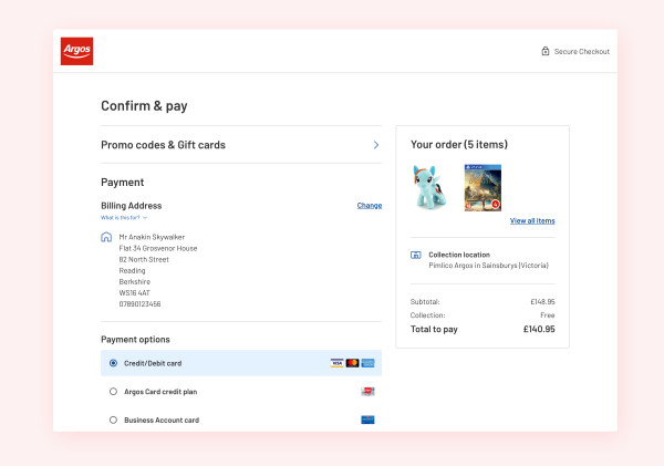
Retail checkout
My first project at Sainsbury's was to lead the front-end development team on the long awaited checkout migration project of all their sub brands (Argos, Habitat, Tu Clothing). With much of their checkout experiences still driven by dated IBM WebSphere software and an even more dated UX/UI experience, the aim was to completely modernise the bottom of funnel flow.
Business objectives
Fast, straightforward checkout experience that delights the customer
Reassurance of placed orders and clear communication of key information
Migrate to AWS microservice infrastructure
Newly designed React based front-end
Front-end architecture
With much of the existing top of funnel ecosystem recently adopting micro frontends our app would take the same approach. We use a NodeJS powered Express application to render our React UI along with a custom built route based server-side data fetching pattern, similar to Next's getInitialProps. Our UI communicates with a checkout API microservice "snapshot" which is a data representation of the current users journey within the checkout flow. The UI is in frequent interaction with the snapshot to ensure the front-end and back-end are aligned.
Front-end goals
For such a high impact project I wanted to push for excellence in three main areas of the UI whilst development was ongoing.
Accessibility
Inclusive design was a key focus of mine during this project. I didn’t want to simply create a passable experience but instead I wanted to build a delightful one. Existing Argos design system components were re-built or enhanced to meet industry standards not only enhancing our project but the rest of the Argos website. Particular attention was focused on the following areas:
Enhancing screen reader UI labelling for text & iconography
Fully functional keyboard only navigation
Focus state retention when opening & closing modals
Relative font scaling respecting user controlled zoom & browser defaults
Meeting color contrast standards for both existing and new components
Micro interactions
The use of animation to convey meaning within UIs is something I add to all of my projects. A subtle addition of animation can have a big impact and provide missing context. Given the significance of this part of the customer journey, we maximised this to communicate to the user at nearly all stages.
Asynchronous button animations
Themable place order animation
View, add & edit address modals
Testing
Improving upon existing TDD standards was an objective of mine during this project. The aim was to increase DX (Developer experience) and increase test confidence.
React Testing Library
With the rest of Sainsbury's & Argos deeply invested in Jest & Airbnb's Enzyme, I wanted to modernise our teams UI testing and opted for introducing RTL. RTL's testing philosophy of testing the software as the user experiences it was a welcome change by all and massively improved our test confidence and even more notable the ability to quickly refactor due to less implementation detail being tested.
Cypress
Switching from WebDriver.io to Cypress.io was another welcome change, not only in developer experience but also reducing E2E test flakiness. As the migration to Cypress was mid project and our existing WD.IO e2e tests were written in Cucumber (Given/When/Then) syntax, we chose the Cypress cypress-cucumber-preprocessor plugin which enabled us to almost seamlessly migrate tests with very little changes to the underlying support files.